 Glamping hub
Host dashboard redesign
Improving key booking metrics through enhancing the host experience
About Glamping hub
Glamping hub↗ was launched in 2013, It's a developer of an online booking platform designed to offer camping and alternative accommodations for travelers.
My role
Product Designer
Responsabilities
Discovery, Research, Task prioritisation, UX/UI, Development monitoring and testing.
Context
In Glamping Hub there are two dashboards, Host and Guest, they communicate with each other but technically they are independent, they both influence the user's journey.
In the host dashboard more things happen and therefore there are more problems, but also more opportunities.
-
On the other hand, the recent Design system↗ has not yet been applied to the panels.
Problem
The host's control panel was outdated and failed to meet the basic needs of users, directly impacting key metrics such as booking requests and confirmations.
Understand
Considering the complex nature of the project and the main objective, We did stakeholders interviews, data analysis, interviews with five users and a task analysis provided a wealth of information which was distilled into the following weaknesses. These methods were chosen for their quick, simple and informal nature, ensuring a natural extraction of processes, thoughts and experiences.

Relevant data
12%
of hosts use the support team for confirmation.
22%
of booking requests are not answered
4 out of 10
active hosts have never confirmed a booking request
Pain points
Mobile version not very usable
Responsive version with many bugs, easy to get lost on key pages, slow processes.
Lack of notifications
Hosts don't confirm requests because the notification and action flows are confusing and insufficient.
Inneficient processes
Hosts don't manage their bookings on the dashboard because they find the recurring processes and actions uncomfortable and unclear.
Calendar closed
The tool doesn't take into consideration that most of the accommodations are also published on other booking platforms.
Define
In Glamping hub agile startup nature, quick insights were essential. I conducted competitor analysis, researched admin interface best practices, used existing documentation, and collaborated with the CEO, CTO and Support team to shape major decisions for each user goals.
Insights
Hosts are not properly informed
They need more reminders of required actions and relevant information, resulting in them not accessing or responding to the dashboard.
Design is not in line with UX principles
Failures in consistency, usability, hierarchy, accessibility, etc. result in the user not completing tasks successfully and/or without frustration.
Accommodation is not editable
Hosts must constantly ask for changes to the description, as it is only allowed in some basic settings.
Side navigation with too much content
The size and complexity of the current dashboard makes a single menu insufficient.
The calendar is very static and inflexible
The lack of direct actions and booking information makes it an unhelpful display.
Task priorisation
We translated the learnings into design criteria (Musts, should, could and won't). This of course was possible through collaboration with other teams.
-
From the criteria established we then moved on to create the solutions. We did design sessions involving various roles from technology and support team.
Design
Flows and wireflows
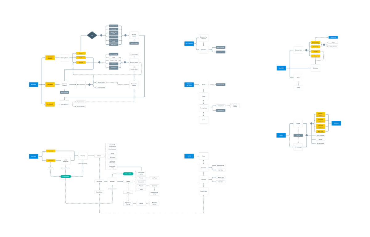
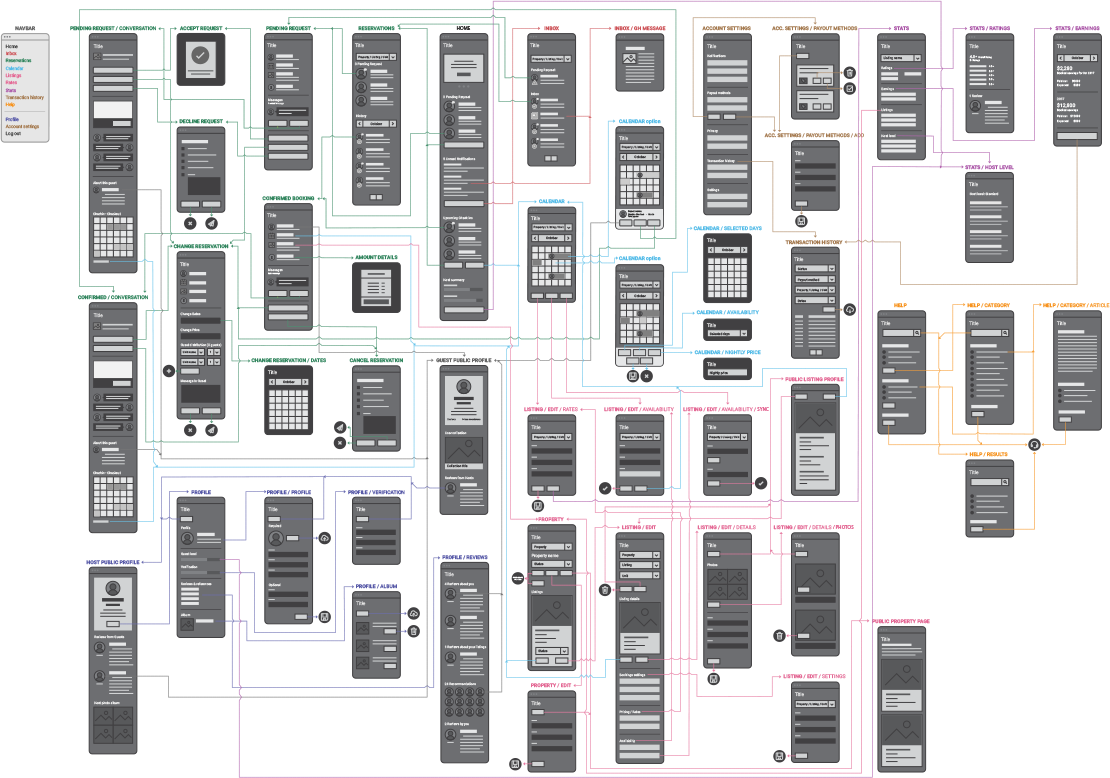
Define the different paths and decisions a host can take depending on the objective. The aim is to simplify the most common processes and reduce time by eliminating duplicate flows and ordering steps.
Before digging into the visual iteration, various content blocks were created with existing proposed documentation (content architecture, stakeholder insights). This allowed me to discuss the best structural approach for the dashboard and navigation with the stakeholders.
Prototyping
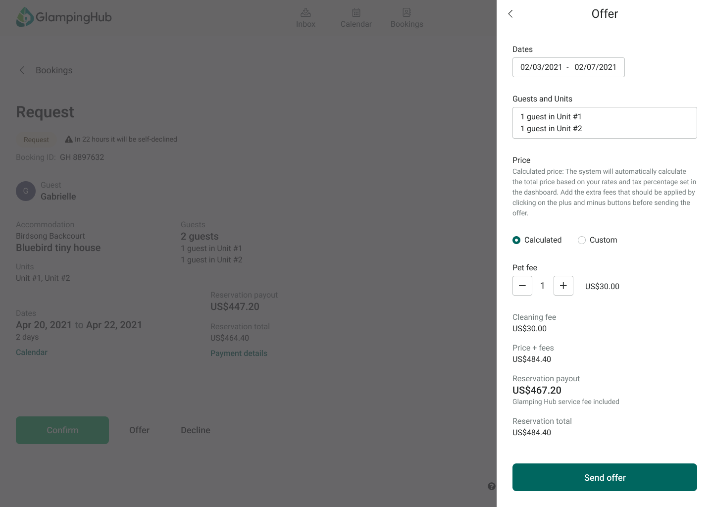
We decided to attack in the most direct and quick way the main needs and pains of the hosts to see quick results, thinking about this, we selected four groups of actions: mobile version, notifications, usability and calendar sync.
Mobile version
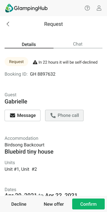
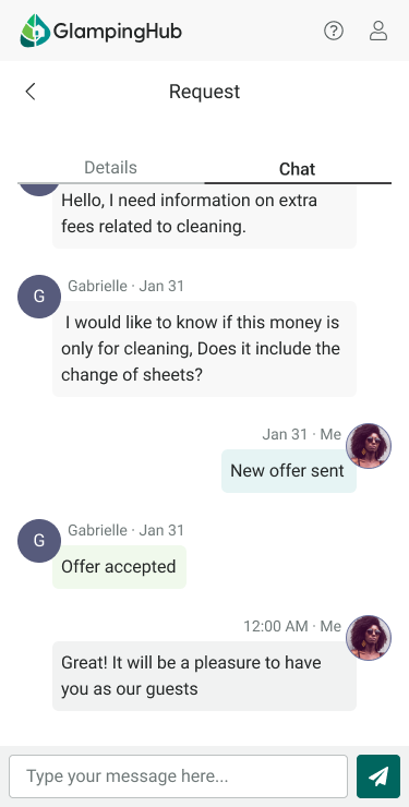
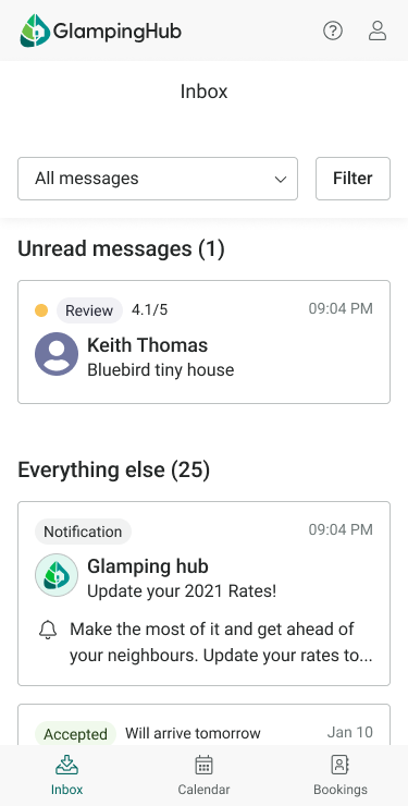
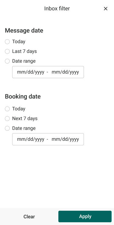
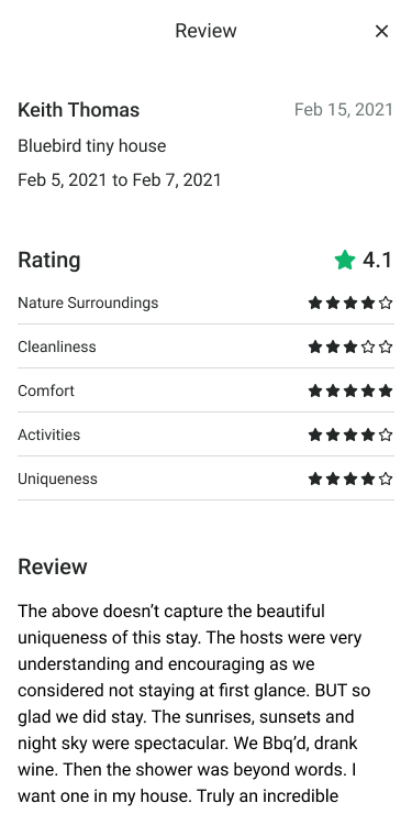
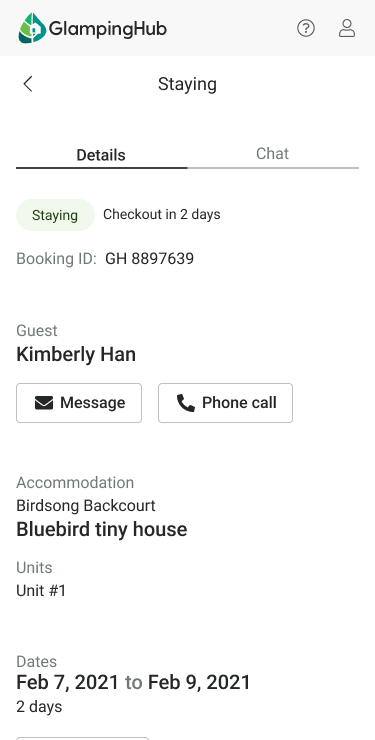
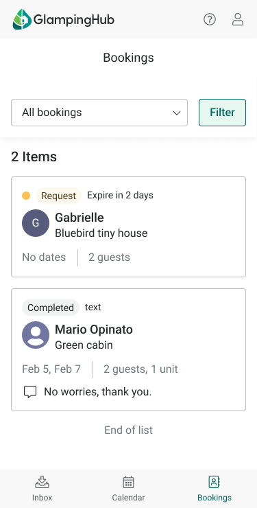
We took a mobile-first approach and redesigned the site, focusing on navigation and information architecture, but also keeping in mind alignment with the desktop version and design system. We fixed historical bugs and made the information easier to read.

Notifications
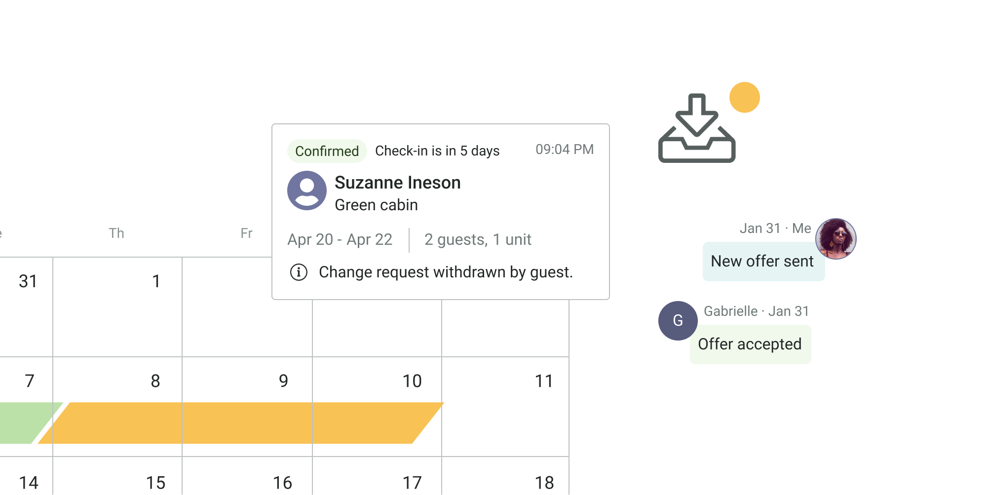
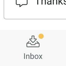
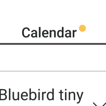
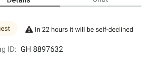
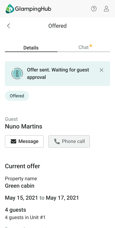
We analysed the flow and placed the design system's notification bubble at the different access points to the places where there is an urgent call, mainly related to pending bookings.
-
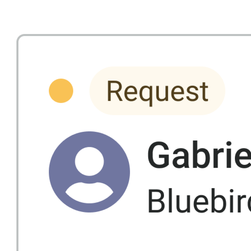
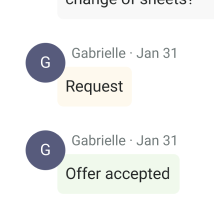
Coloured pills were added to highlight the urgency status and added status changes to the conversation section.
Calendar sync
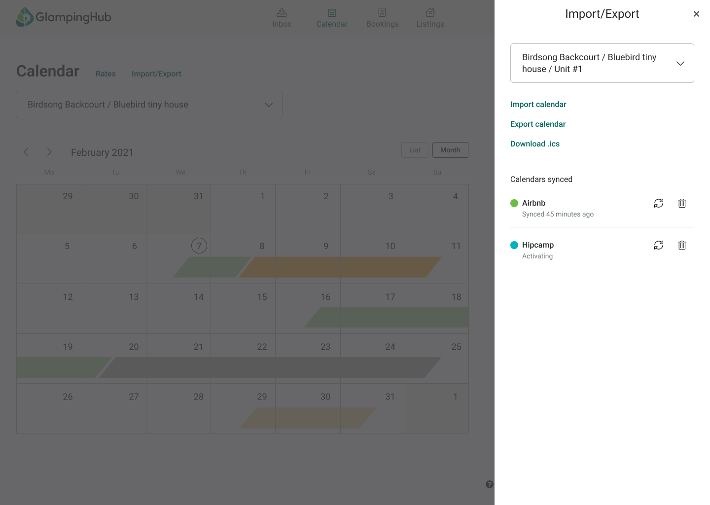
Design and development of an MVP for hosts to import, export and synchronise their external calendars with the Glamping Hub calendar.
Usability
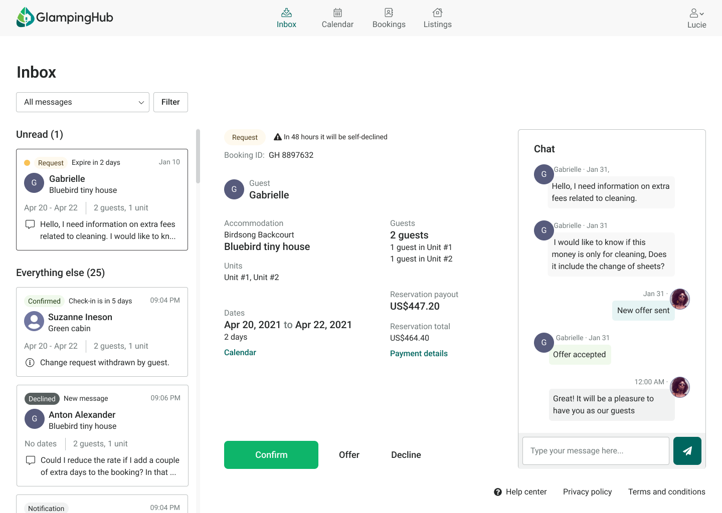
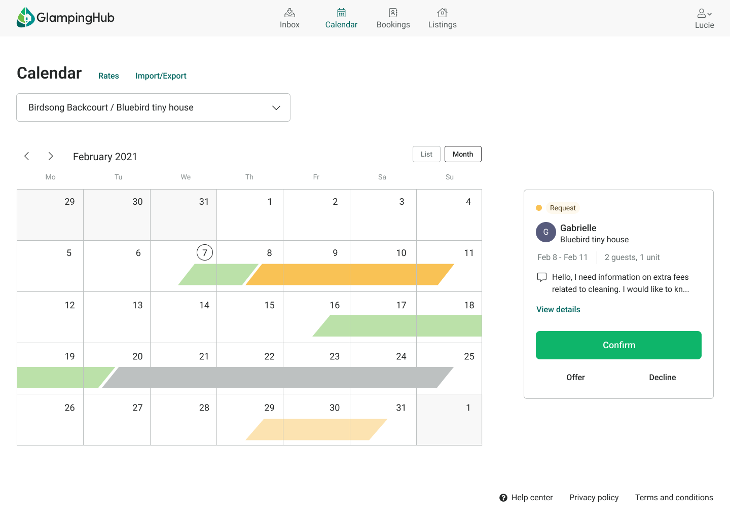
To improve the usability of the dashboard, we prioritise navigation, information architecture, consistency and error prevention.
-
Our proposal aimed to be simple and clear, eliminating artifice and useless or confusing content. We wanted the user to understand and flow naturally when they landed on the dashboard.
Develop
Hand off
We prioritized making our design developer-friendly. By thoroughly reviewing screen flows and adding notes, developers can understand interactions without the prototype. Arrows depict flow progression, and specifications provide element measurements, reducing ambiguity.

Launch and measure
In the first few days of the launch we had many requests for help with the new design, which we resolved by adding help tips and improving the visibility of some key elements.
Results
After the adoption period, we measured the impact over several weeks. The numbers were very positive and supported some of the hypotheses and solutions.
-
Thanks to more up-to-date calendars, the possibility of direct booking in some cases and earlier responses to users' requests and queries, the number of booking confirmations increased rapidly.
7%
more booking requests (YOY)
11%
more confirmed requests (YOY)
8%
more DAU (Daily active users) (YOY)
-10%
of host management requests to support team (annual avg)
12%
less bookings cancelled by the host (YOY)
20%
reduction in response time to guests (annual avg)
Key learnings
Divide to measure
We should have released each block of improvements separately to better monitor the impact of each solution. We only separate the sync.
Clear roadmap
Investing time and effort in structuring the tasks well and launching them was fundamental to the development of the project. We had several errors in the planning but we were able to fix them but they affected the launch times.
Communication is the key
Thanks to continuous communication, we avoided many misunderstandings, understood the needs of the different stakeholders and the team was always aligned with the proposal.
Next steps
The design team continued to make and test improvements to the dashboard.
The following quarters saw the release of improvements such as; synchronisation with booking managers, new calendar views, editing of all accommodation details, help center, as well as iterations on live features.
